Objects~
There are two ways to create an object on the screen:
- Uploading a
pages.jsonlfile onto the internal flash - Use the
jsonlcommand (via MQTT, serial or telnet console)
Cheatsheet~
| obj | Type | Description | Extra Parts |
|---|---|---|---|
| btn | Binary | Button | |
| switch | Toggle | Switch | indicator, knob |
| checkbox | Toggle | Checkbox | indicator |
| label | Visual | Label | |
| led | Visual | LED | |
| spinner | Visual | Spinner | indicator |
| obj | Visual | Base Object | |
| line | Visual | Line | |
| img | Visual | Image | |
| cpicker | Selector | Color picker | knob |
| roller | Selector | Roller | selected |
| dropdown | Selector | Dropdown List | selected, items, scrollbar |
| btnmatrix | Selector | Button Matrix | items |
| msgbox | Selector | Messagebox | items, items_bg |
| tabview | Selector | Tabview | items, items_bg, indicator, selected |
| tab | Selector | Tab | |
| bar | Range | Progress Bar | indicator |
| slider | Range | Slider | indicator, knob |
| arc | Range | Arc | indicator, knob |
| linemeter | Range | Line Meter | |
| gauge | Range | Gauge | indicator, ticks |
Common Parameters~
Common Properties~
These are the common properties shared among all objects,
but only the id and obj properties are required to create an object:
| Property | Value | Default | Description |
|---|---|---|---|
| id | 1..254 | n/a | Required. ID of the object on this page. 0 for the page itself. |
| obj | string | n/a | Required. Name of the object type (see below) |
| page | 0..12 | n/a | ID of the page the object appears on (see below) |
| groupid | 0..15 | 0 (none) | ID of the GPIO group the object belongs to |
| x | int16 | 0 | Horizontal position on the page |
| y | int16 | 0 | Vertical position on the page |
| w | int16 | 0 | Width of the object |
| h | int16 | 0 | Height of the object |
| enabled | bool | true | Object is touchable, if false, a disabled style is applied |
| hidden | bool | false | Object is hidden |
| opacity | uint8 | 255 | How much the the object is opaque |
| swipe | bool | false | Page navigation using swipe gestures (see below) |
| action | string | 0 | Command handled locally (see below) |
| click | bool | true | Object is touch/clickable (also see enabled) |
| ext_click_h | uint8 | 0 | Extended horizontal clickable are on the left and right |
| ext_click_v | uint8 | 0 | Extended vertical clickable are on the top and bottom |
| parentid | uint8 | 0 | Set the object to be the child of another object.x and y will be relative to the parent object. Property inheritance can affect the appearance of the of the children (more info in styling). |
| tag | JSONobject | n/a | Arbitrary attribute data. Once set, it will be included in each event message. For advanced scenarios (more info in an example). |
| jsonl | JSONobject | n/a | Pseudo-property to set multiple properties of an existing object in one go with a JSON object. |
Tip
Further customizable properties can be found in styling.
Ids start from 1 on each page. You can have a maximum of 254 ids on each page. You don't have to use them in ascending order, you can for example use them for logical numbering (start labels from 11, 12, 13, buttons from 21, 22, 23 etc.)
Pages~
If the page parameter is not present, the object is placed on the same page as the previous object. If page is not specified for the first object either, the current page being displayed is used.
"page":0 indicates that the object is visible on all pages. It can be used for example to specify a static menu bar.
You can still hide the object on select pages if needed. Objects on page 0 appear on top of any objects on the underlying page.
Actions~
Action commands are supported only by binary or visual type of objects and they are performed locally on the plate. The following actions can be set for these objects:
p1top12to switch to the corresponding page numbers directlyprevto switch to the previous pagenextto switch to the next pagebackto go back to the home page
Check out the example for how to implement actions.
You can change the target pages using prev, back and next page attributes operation on the page objectpXb0.
Swipe ~
Objects and page area (p0bY) support swipe property. Enabling this will process left, right and down swipes on the object as next, prev and back page changes, respectively. The start of the swipe needs to be on the element which has this property enabled for the feature to activate.
Note
Page id p0b0 is not valid to set this property as it has to be set on real elements.
Events~
All objects are touchable by default and respond to touch events. To disable touch events for an object set its enabled property to false. In this case the touch event "goes through" to the object on the layer below or to the page itself.
Events (and values) are published in a state topic corresponding to the object, eg. hasp/<nodename>/state/p1b2 with payload in json format eg. {"event":"up","val":1}.
Possible events (depending on object type) are:
| Event | Description |
|---|---|
down |
Occurs when a button goes from depressed to pressed (the moment of touch) |
up |
The button was released within a short time i.e. a short press has occurred |
release |
The button is released after being pressed for over the threshold time |
long |
Event is sent when the button is still being pressed after the threshold time of 400ms |
hold |
The HOLD event is repeated every 200ms while the button is still pressed |
changed |
Event is sent when the value of the object has changed during the event |
Tip
To actively see the sent out events you can use an MQTT client app and subscribe to the hasp/# topic.
Common Methods~
These are the common methods shared among all objects,
| Method | Parameters | Description |
|---|---|---|
clear |
Delete the children from the object | |
delete |
Delete the object and its children from the page | |
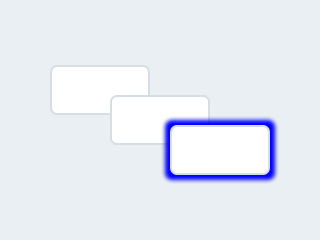
to_front |
Bring the object to the front on the page | |
to_back |
Send the object to the back on the page |
Example commands:
1 2 | |
Object Types
Each object type is an ID that indicates which object type that line represents. Besides the common properties listed above, each object type can have specific properties.
Text Label~
obj:label
| Property | Value | Default | Description |
|---|---|---|---|
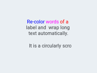
| text | string | "Text" | The text of the label, \n for line break. Can also be a variable. |
| mode | string | crop |
The wrapping mode of long text labels:expand Expand the object size to the text sizebreak Keep the object width, break the too long lines and expand the object heightdots Keep the size and write dots at the end if the text is too longscroll Keep the size and roll the text back and forthloop Keep the size and roll the text circularlycrop Keep the size and crop the text out of it |
| align | string | left |
Text alignment: left, center, right |
It's possible to set the color of characters in the text indvidually, just prefix the text to be re-colored with a #RRGGBB hexadecimal color code and a space, and close with a single hash # tag.
Example jsonl
1 2 | |
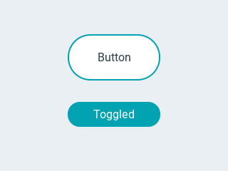
Button~
obj:btn
| Property | Value | Default | Description |
|---|---|---|---|
| toggle | bool | false | When enabled, creates a toggle-on/toggle-off button. If false, creates a normal button |
| val | int16 | 0 | The value: 0 = untoggled, 1 = toggled |
| text | string | "" | The text of the label |
| mode | string | expand |
The wrapping mode of long text labels.expand Expand the object size to the text sizebreak Keep the object width, break the too long lines and expand the object heightdots Keep the size and write dots at the end if the text is too longscroll Keep the size and roll the text back and forthloop Keep the size and roll the text circularlycrop Keep the size and crop the text out of it |
| align | string | left |
Text alignment: left, center, right |
Similar to the text label, it's possible to set the color of characters in the text indvidually, just prefix the text to be re-colored with a #RRGGBB hexadecimal color code and a space, and close with a single hash # tag.
Example jsonl
1 2 | |
Normal buttons (toggle=false) send touch events while they occur:
Short touch:
1 2 | |
Long press:
1 2 3 4 5 | |
Toggle buttons (toggle=true) send out the old value in the down event and the new value in the up event when released:
Toggle ON:
1 2 | |
Toggle OFF:
1 2 | |
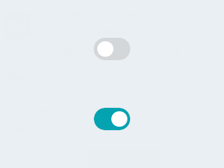
Switch~
obj:switch
| Property | Value | Default | Description |
|---|---|---|---|
| val | bool | 0 | 1 = on, 0 = off |
| bg_color10 | color | 0 | changes indicator color |
| bg_color20 | color | 0 | changes knob color |
| radius20 | int16 | depends on theme |
changes knob corner radius (also see radius) |
Example jsonl
1 | |
Events generated by switch are similar to the ones generate by the toggle buttons.
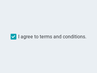
Checkbox~
obj:checkbox
| Property | Value | Default | Description |
|---|---|---|---|
| val | int16 | 0 | 1 = checked0 = unchecked |
| text | string | "Checkbox" | The label of the checkbox |
Note
The checkbox object ignores the w and h attribute. These are calculated
based on the font and text.
Example jsonl
1 | |
Events generated by checkbox are similar to the ones generate by the toggle buttons.
Progress Bar~
obj:bar
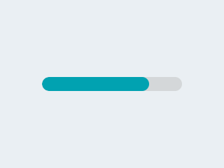
| Property | Value | Default | Description |
|---|---|---|---|
| min | int16 | 0 | minimum value of the indicator |
| max | int16 | 100 | maximum value of the indicator |
| val | int16 | 0 | current value of the indicator |
| start_value | int16 | 0 | optional minimal allowed value of the indicator |
Vertical bars can be created if the width of the object is smaller than its height.
Note
min, max, val and start_value also support negative values.
Slider~
obj:slider
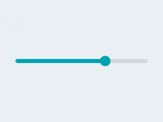
| Property | Value | Default | Description |
|---|---|---|---|
| min | int16 | 0 | minimum value of the indicator |
| max | int16 | 100 | maximum value of the indicator |
| val | int16 | 0 | current value of the indicator |
| start_value | int16 | 0 | optional minimal allowed value of the indicator |
Vertical sliders can be created if the width of the object is smaller than its height.
Note
min, max, val and start_value also support negative values.
Example jsonl
1 | |
While pressing and dragging the slider object the following events are sent: down (old value), changed (repeatedly until released) and up (value at the moment of releasing it):
1 2 3 4 5 6 7 | |
Arc~
obj:arc
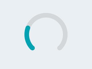
| Property | Value | Default | Description |
|---|---|---|---|
| min | int16 | 0 | minimum value of the indicator |
| max | int16 | 100 | maximum value of the indicator |
| val | int16 | 0 | current value of the indicator |
| rotation | int16 | 0 | offset to the 0 degree position |
| type | 0-2 | 0 | 0 = normal, 1 = symmetrical, 2 = reverse |
| adjustable | bool | false | Add knob that the user can operate to change the value |
| start_angle | 0-360 | start angle of the arc background (see note) | |
| end_angle | 0-360 | end angle of the arc background (see note) | |
| start_angle10 | 0-360 | start angle of the arc indicator (see note) | |
| end_angle10 | 0-360 | end angle of the arc indicator (see note) |
Note
Zero degree is at the middle right (3 o'clock) of the object and the degrees are increasing in a clockwise direction. The angles should be in the [0-360] range.
min, max and val also support negative values.
Tip
To adjust the size of the knob, use pad_top20, pad_bottom20, pad_left20, pad_right20 styling properties. If you increase the knob beyond the margins of the object, you also need to increase pad_top, pad_bottom, pad_left, pad_right for the arc itself.
Check out value styling to display a textual value in the middle of the arc.
Example jsonl
1 | |
While pressing and dragging the arc object the following events are sent: down (old value), changed (repeatedly until released) and up (value at the moment of releasing it):
1 2 3 4 5 6 7 | |
Dropdown List~
obj:dropdown
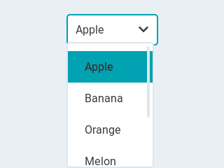
| Property | Value | Default | Description |
|---|---|---|---|
| options | string | "" | List of items separated by \n |
| val | int16 | 0 | The number of the selected item |
| text | string | "" | Read-only The text of the selected item |
| direction | byte | 0 | Direction where the dropdown expands:0 = down, 1 = up, 2 = left, 3 = right Note: up and down are superseeded by the screen size. |
| show_selected | bool | true | Show the selected option or a static text |
| max_height | int16 | 3/4 of screen height | The maximum height of the open drop-down list |
| Method | Parameters | Description |
|---|---|---|
| open | To manually open the drop-down list | |
| close | To manually close the drop-down list |
To change the currently selected item, use the val attribute.
To change the items in the list, use the options attribute.
Example jsonl
1 | |
When the item is changed both val and text of the newly selected item are send out accompanied by the change event.
Roller~
obj:roller
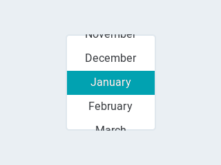
| Property | Value | Default | Description |
|---|---|---|---|
| options | string | "" | List of items separated by \n |
| val | int16 | 0 | The number of the selected item |
| text | string | "" | Read-only The text of the selected item |
| rows | int8 | 3 | The number of rows that are visible Use this property instead of h to set object height |
| mode | 0..1 | 0 | Roller mode: 0 = normal (finite), 1 = infinite |
| align | string | center |
Text alignment: left, center, right |
To change the currently selected item, use the val attribute.
To change the items in the list, use the options attribute.
Example jsonl
1 | |
When the item is changed both val and text of the newly selected item are send out accompanied by the change event.
Line Meter~
obj:linemeter
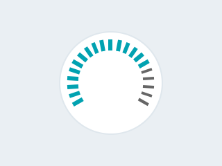
| Property | Value | Default | Description |
|---|---|---|---|
| min | int16 | 0 | minimum value of the indicator |
| max | int16 | 100 | maximum value of the indicator |
| val | int16 | 0 | current value of the indicator |
| angle | 0-360 | 240 | angle between start and end of the scale |
| line_count | uint16 | 31 | tick count of the scale |
| rotation | 0-360 | 0 | offset for the scale angles to rotate it |
| type | 0-1 | 0 | 0 = indicator lines are activated clock-wise1 = indicator lines are activated counter-clock-wise |
Use line and scale properties to customize.
Note
min, max and val also support negative values.
Example jsonl
1 | |
Gauge~
obj:gauge
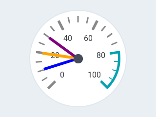
| Property | Value | Default | Description |
|---|---|---|---|
| min | int16 | 0 | minimum value of the indicator |
| max | int16 | 100 | maximum value of the indicator |
| val | int16 | 0 | current value of the indicator |
| critical_value | int16 | 80 | scale color will be changed to scale_end_color after this value |
| label_count | uint8 | number of labels (and major ticks) of the scale | |
| line_count | uint16 | 31 | number of minor ticks of the entire scale |
| angle | 0-360 | 240 | angle between start and end of the scale |
| rotation | 0-360 | 0 | offset for the gauge's angles to rotate it |
| format | uint16 | 0 | divider for major tick values |
To strip trailing zero's of major tick labels the format divider can be used to scale the values before printing:
0: print the major tick value as is1: strip 1 zero, i.e. divide tick value by 10 before printing the major tick label2: strip 2 zeros, i.e. divide tick value by 100 before printing the major tick label3: strip 3 zeros, i.e. divide tick value by 1000 before printing the major tick label4: strip 4 zeros, i.e. divide tick value by 10000 before printing the major tick label
Only these values are allowed, arbitrary numbers are not supported.
Note
min, max and val also support negative values.
Example jsonl
1 | |
Use scale properties to customize.
Tabview~
obj:tabview
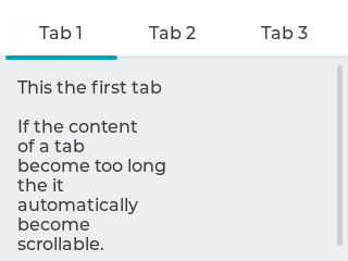
A tabview is an object that can hold multiple tab objects.
You first create the tabview object and then add tab objects to it.
| Property | Value | Default | Description |
|---|---|---|---|
| val | int8 | 0 | The number of the active tab, starting at 0 |
| text | string | "" | The name of the active tab |
| btn_pos | 0..4 | 1 | Position of the tab buttons:0 = none1 = top2 = bottom3 = left4 = right |
| count | uint16 | 0 | Read-only The number of tabs of the tabview |
To change the currently visible tab, use the val attribute after all tabs have been added.
Note
To adjust the height of the tab buttons row, use pad_top40 and pad_bottom40 styling properties. Accepts also negative values.
To adjust the text size of the tab names, use the text_font40 styling property.
Read further down to learn now to add tabs to the tabview.
Tab~
obj:tab
| Property | Value | Default | Description |
|---|---|---|---|
| parentid | int8 | 0 | The id of the tabview object to which this tab is added |
| text | string | "Tab" | The name of tab button |
Set the parent object (which tabview the tabs belong to) by referencing the parentid when creating the tab.
To add other objects to these tabs, set the parentid when creating those objects to the id of the tab you wamt them to appear on.
Example jsonl
1 2 3 4 5 6 7 | |
Color picker~
obj:cpicker
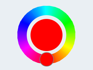
| Property | Value | Default | Description |
|---|---|---|---|
| color | color | 0 | The selected color in html format #rrggbb |
| scale_width | uint16 | 25 | The width of the color gradient of the circle |
| pad_inner | int16 | 10 | The padding between the circle and the inner preview circle |
The object will automatically adjust based on the w and h properties: when the object is longer then it is height a rectangular color picker is created, otherwise it will be circular.
By long pressing the inner preview circle, the color picker will through the color modes: hue > saturation > value. Double-click on the inner preview circle to reset the current value.
Setting Color~
Example MQTT commands:
1 2 3 | |
Events~
While pressing and dragging the cpicker object the following events are sent: down (old color), changed (repeatedly until released) and up (value at the moment of releasing it):
1 2 3 4 | |
Spinner~
obj:spinner
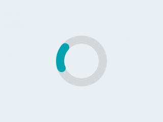
| Property | Value | Default | Description |
|---|---|---|---|
| speed | int16 | 1000 | The time for 1 turn in ms |
| direction | int16 | 0 | 0 = clockwise, 1 = counter-clockwise |
| angle | 0-360 | 60 | The length of the spinning segment in degrees |
| type | 0-2 | 0 | 0 = slow down on the top, 1 = slow down and stretch, 2 = constant speed no stretch |
| line_width | int16 | 20 | The width of the background circle |
| line_width10 | int16 | 20 | The width of the spinning segment |
| line_color | color | depends on theme |
color of the background circle |
| line_color10 | color | depends on theme |
color of the spinning segment |
Tip
Check out background, border, and line styling to adjust other aspects of the appearance.
Note
Placing objects over/under the spinner will increase the CPU load because all objects need to be redrawn constantly.
Example jsonl
1 | |
LED Indicator~
obj:led
| Property | Value | Default | Description |
|---|---|---|---|
| val | byte | 0 | The brightness of the indicator [0..255] |
Button Matrix~
obj:btnmatrix
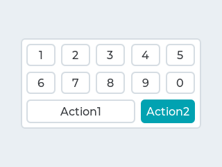
| Property | Value | Default | Description |
|---|---|---|---|
| options | json array | "Text" | Json array of strings where each element is the label of a button. Use "\n" for a new line of buttons |
| align | string | center |
Text alignment: left, center, right |
| toggle | bool | false | All buttons behave as toggle buttons or normal buttons |
| one_check | bool | false | Allow only one button to be checked (toggled) at once |
| val | int8 | 0 | The number of the active button, starting at 0. In conjunction with toggle and one_check set it to -1 to deactivate all buttons |
The styling properties apply to all buttons in the matrix.
To change the color of a single label you can prefix the text with a #RRGGBB hexadecimal color code and close with a single hash # tag.
Example jsonl
1 | |
Messagebox~
obj:msgbox
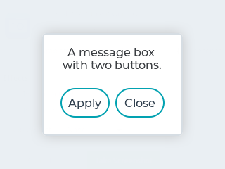
| Property | Value | Default | Description |
|---|---|---|---|
| text | string | "" | The text of the message to be displayed. |
| options | json array | ["OK"] | Json array of strings where each element is the label of a button |
| bool | false | Make the messagebox a modal dialog requiring user input | |
| auto_close | int16 | 0 | Close the pop-up message automatically after this number of milliseconds have passed |
The Message boxes act as a pop-up. The default width is the horizontal screen size, the height adjusts according to the contents of the message. The pop-up is centered on the screen.
Note
The messagebox object is automatically deleted when it is closed. You will need to create it again using jsonl to pop-up a new message.
Example jsonl
1 | |
Line~
obj:line
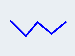
| Property | Value | Default | Description |
|---|---|---|---|
| points | JSON array | "" | The name of the image file |
| auto_size | bool | true | Automatically set the size of the line object to the outer bounds |
| y_invert | bool | false | The y direction might be counter-intuitive in some cases so the y coordinates can be inverted |
The points parameter is a JSON array of [x,y] coordinates, for example [[10,25],[100,25],[100,0]].
Example jsonl
1 | |
Image~
obj:img
| Property | Value | Default | Description |
|---|---|---|---|
| src | string | "" | The name of the image file |
| auto_size | bool | true | Automatically set the size of the image object to the image source |
| offset_x | int16 | 0 | Shift the picture horizontally relative to the image object |
| offset_y | int16 | 0 | Shift the picture vertically relative to the image object |
| zoom | uint16 | 256 | A larger value enlarges the images (e.g. 512 double size), a smaller value shrinks it (e.g. 128 half size). Fractional scale works as well. E.g. 281 for 10% enlargement. |
| angle | int16 | 0 | Rotate the picture around its pivot point. Angle has 0.1 degree precision, so for 45.8° use 458. |
| pivot_x | int16 | H center | The pivot point of the rotation, by default centered |
| pivot_y | int16 | V center | The pivot point of the rotation, by default centered |
| antialias | bool | false | The quality of the angle and zoom transformation. With enabled anti-aliasing the transformations has a higher quality but they are slower. |
Note
You can use image_recolor and image_recolor_opa from the image styling properties to apply a color overlay mask.
Either PNG or BIN image files are supported, from flash:
-
PNG image are decoded and kept in memory, thus you'll be able to display full-screen images only if your microcontroller has installed PSram memory, else you will be limited to small icons or
BINfiles. -
BIN images are not stored in memory and are read from flash each time. This will be slower but allows the use of larger images even if your microcontroller doesn't have PSram.
-
BIN images from flash do not support
zoomorangletransformations. -
Use the online LVGL Image Converter to create BIN files. Set the output format to Binary or Binary RGB565.
Example jsonl
1 | |
Base Object~
obj:obj
The Base Object can be directly used as a simple, empty widget. It is nothing more then a (rounded) rectangle.
You can use it as a background shape for other objects by putting its jsonl line before the object. It catches touches!
Example jsonl
1 | |